Penny Juice

Logo and Packaging Design

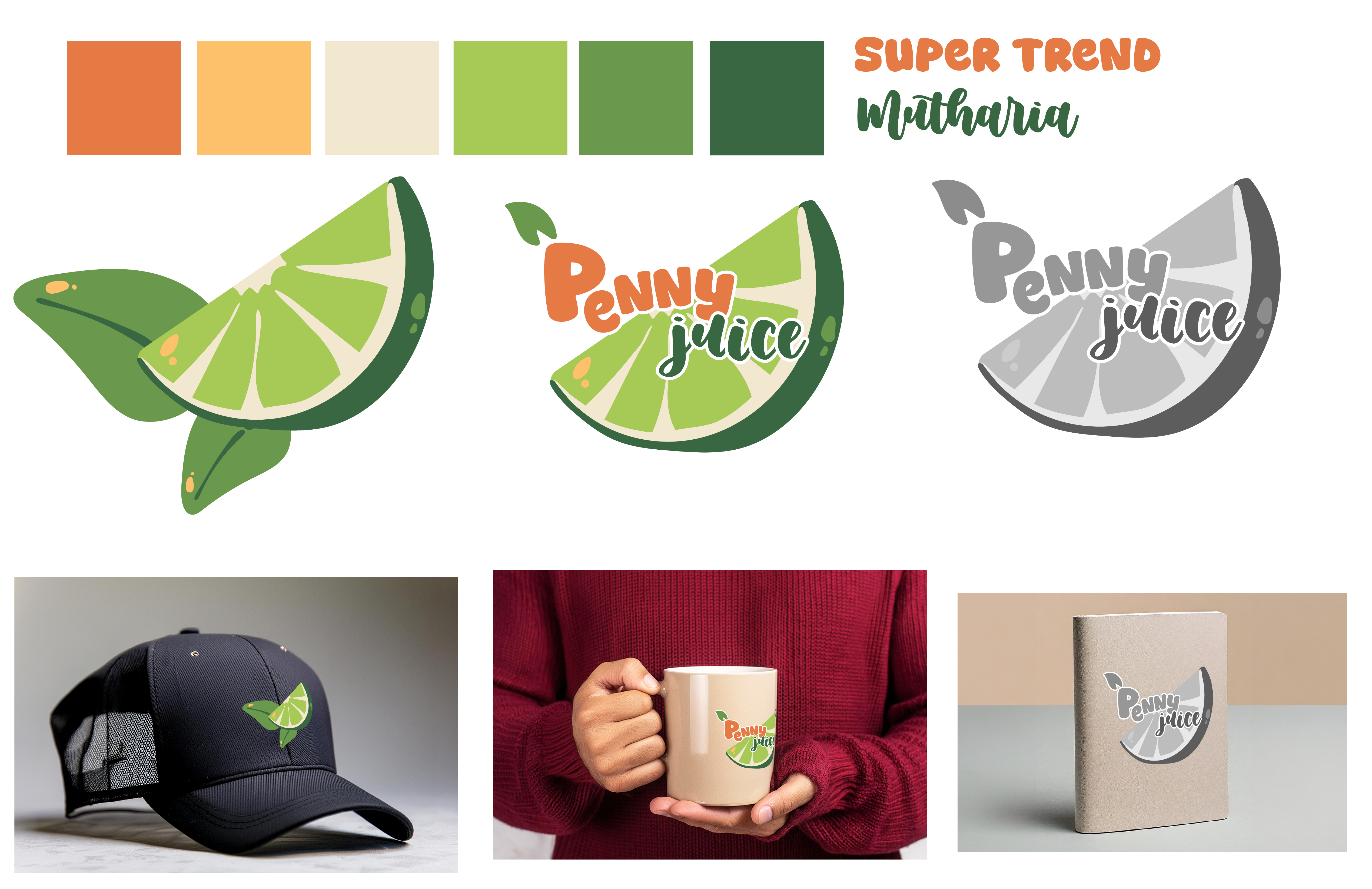
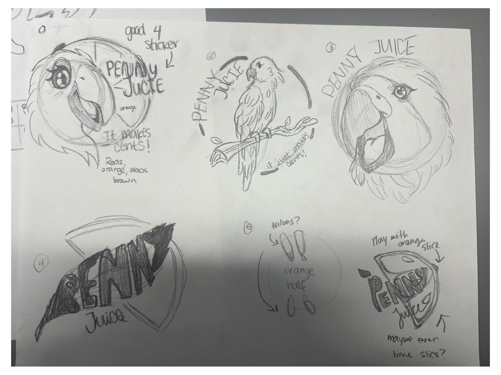
Design Problem: For the design problem, we were given the Penny Juice website to redesign. Our very first step was the logo. Their original logo was cluttered and hard to read. Like my good friend Cole said, "It looks like a dirty penny!" I didn't focus on the color scheme of the original website, mainly because they didn't have set colors themselves. I went with more citrus colors!

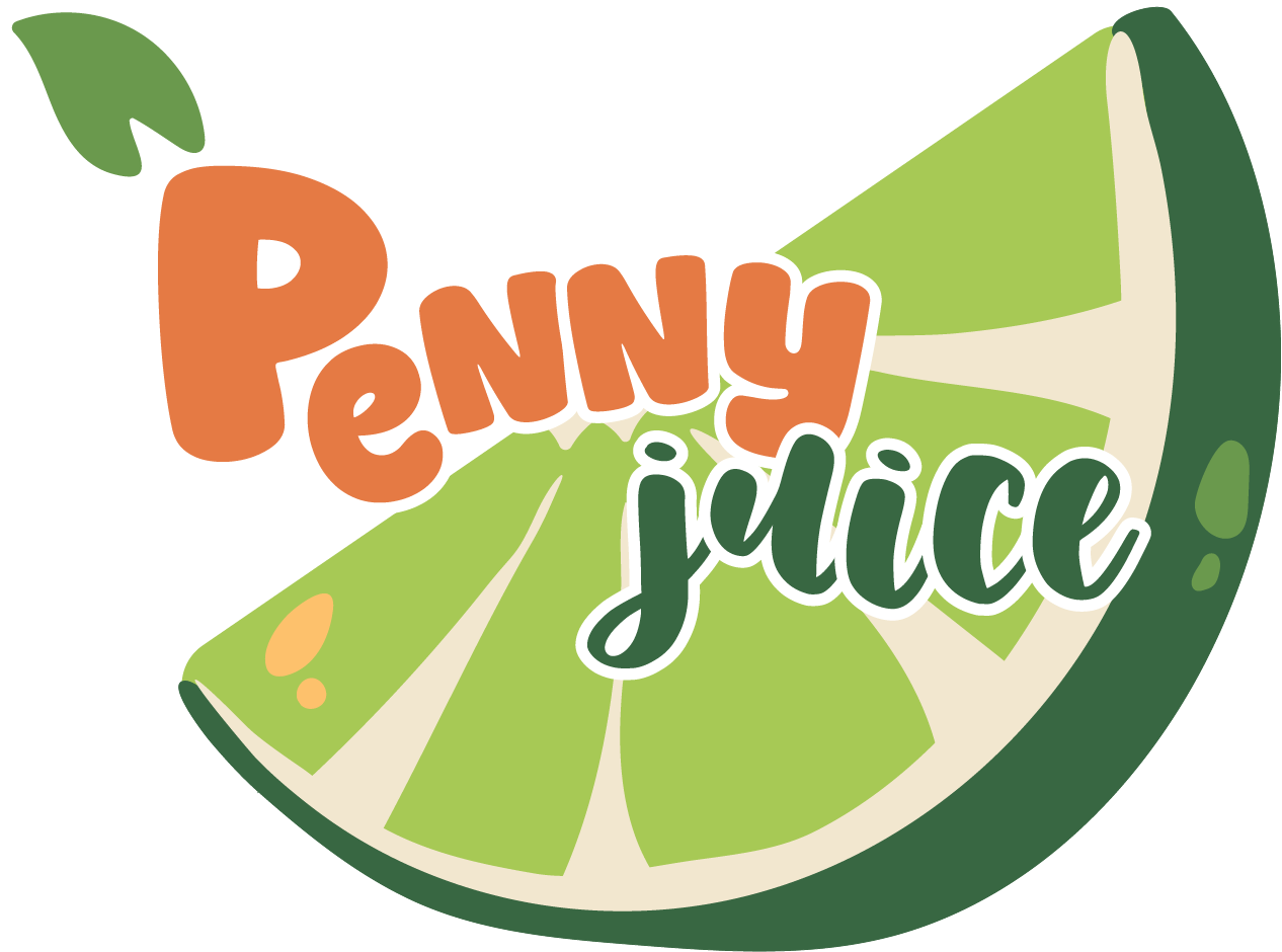
Design Solution: Since their whole concept was juice, I obviously wanted to incorporate fruit. At first I was thinking an orange, but that seems way too common for me. Green is such a vibrant and eye catching color, I wanted to use it as the main color in the logo.

Audience: Parents of children age 4–12.

Software: Adobe Illustrator

Logo Process sketches

Design Process

When I first began the sketches, I wanted to involve something colorful, creative, and very eye catching! As a child, I was always drawn to colorful animals like parrots. I tried creating a few but they ended up way too detailed, and would lose their readability. I simplified it all down to a simple lime slice with a leaf or two. After that, I went on coolors.co to find a color palette. The warm yellow and orange goes along so nicely with the lime green and olive colors. After that, I began my process in Adobe Illustrator. There were many trial and errors, but after some critique I landed on the final design. For a more simple version, there is no text but two leaves behind the fruit. Everything worked out so nicely, and I am very proud of what I've created.